


These are the words of the fourteenth Dalai Lama, and I’ve used this quote a number of times. It’s a good thing to keep in mind as a designer. Following industry standards and best practices is very important; ignoring them is done hopefully out of a lack of awareness and not out of laziness. But a really good designer knows when to break the rules. This is how design evolves.
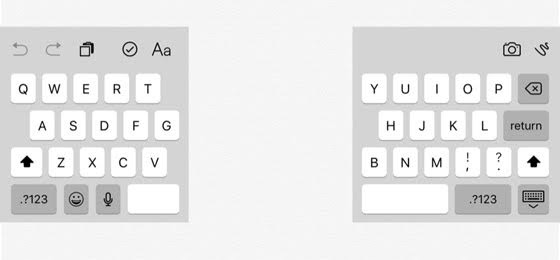
Take the example of the split keyboard, which was introduced in Apple’s iOS 5. The split keyboard is smaller and shows more of the text on the screen than the standard keyboard, but its real value is for people who want to type with two thumbs.
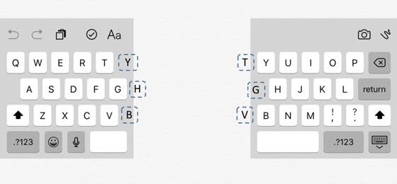
For people who are touch typists, there are certain rules they follow. For example, A-S-D-F is the home position for the left hand. But some rules are a bit softer. For example, either hand can hit the space bar. There is also a soft rule at the border between hands. Depending on what someone is typing, the Y key may be pressed using either the right or the left hand. The same is true for the T key. In fact, it’s true for all keys on the very border that creates the split keyboard.
Like all behaviors we’ve practiced regularly, these rules are not conscious. We make the decision whether to use our left or right hand unconsciously. If not, we would not be able to type at the speed at which we do.
To address this soft rule, the Apple designers could have elected to repeat these keys on the screen. There would’ve been a redundant set of the Y, H, and B keys on the left side and a redundant set of T, G, and V keys on the right. This would have looked odd and, to non-touch typists, its value would be somewhat dubious. Even for those who are touch typists, many may not even be aware that this is their behavior and would not appreciate the value of the design decision. In any case, it probably would generate a lot of questions as to why someone would do this.
What did the designers at Apple elect to do? They broke the rules. There actually is a redundant set of Y, H, and B keys on the left side and a redundant set of T, G, and V keys on the right. They’re just not visible. If you tap just to the right of the T key, you can generate a Y. If you type just to the left of the Y key, you can generate a T, and so on. For those people who are used to doing this when typing, their “muscle memory” will kick in and they will try to type with what would appear to be the wrong thumb but get the expected behavior anyway. They’re unlikely to even notice that they did this. And this comes without a strange looking design, so no questions are generated, but there is a reduction in potential “user error.”
To me, this is a great example of knowing the rules well so you can break them effectively, as advised by the Dalai Lama. I applaud designers who think things like this through and make these kinds of tough decisions. In many companies, making design decisions like this might be quite challenging. Other reviewers or management might not understand. And I can just imagine trying to sell this added code requirement to some developers I’ve worked with who do not accept the distinction between design and development responsibilities and would not understand the value in this type of design themselves. I can only suppose that it must have been easier for the people at Apple to make a design decision like this since Apple encourages this type of mindset as a corporation. This is definitely an important area of design, and any company that lets their designers make these types of design decisions demonstrates how high they are on the user-centered design scale.