


Speaking of Content Management Systems (which we did in the last edition of this newsletter in November), the use of automated tools can lead to issues other than interaction design issues. Take the case of the software designed to automatically create charts and graphs. This software is typically designed to adjust the scale to zoom in on the variations present in the data. This occurs no matter how large or small the variation. Take for example, this graph, generated by an automated tool to show survey data from a well-known survey tool.
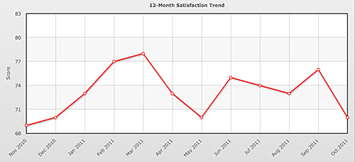
This chart shows, or at least appears to show, large variations in the data (in this case satisfaction data for a site over a 12-month period of time). However, notice that the scale only ranges from 68 to 83. When this same data is displayed on a scale from 0-100 (the actual scale of the data), the impression left is significantly different.
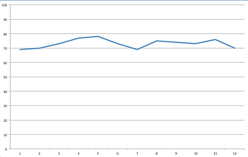
It now appears that the satisfaction data is more or less stable over the same period of time. It is still possible to see the data variation, but its effect is less pronounced (and would have been perceived very differently if you saw the two charts in reverse order).
Now consider a more complicated example. The following three diagrams show data from another survey. This data is displayed on a choropleth map—-a map that uses color to depict statistical data. (The scales are purposely hard to read in these pictures.)
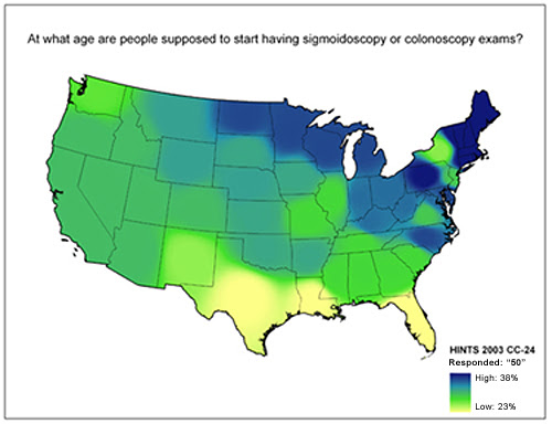
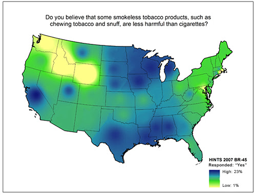
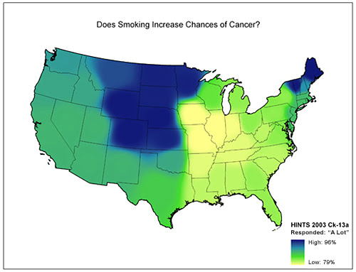
These maps show data ranging from 23%-38%, 1%-23%, and 79%-96%, respectively. But they all use the same color scale for all three subranges. As a result, the user has to know both the scale differences (a 15-point scale, a 22-point scale, and a 17-point scale, which are not particularly different in these examples) as well as the actual ranges represented (significantly different in these examples). Not only is this a difficult task to do while looking at the maps (keeping track of different scales for identical color schemes), our memories are not precise. They are not snapshots or video clips; they are gists of information used to recreate the memory when needed. Some detail is almost always lost in each recall event and the scale is likely to be the first thing that would be lost in these examples. People may recall the general pattern of data, but they are likely to forget the scale or normalize them in their minds. The result could be that people recall there are as many people in Texas that believe smokeless tobacco is less harmful than cigarettes as there are New Englanders who believe smoking increases a person’s risk of cancer. (It’s not true by the way. As many as 96% of respondents in some parts of New England believe smoking increases your chance of cancer, whereas up to only 23% of people in Texas believe smokeless tobacco is less harmful then cigarettes.)
This type of graph is not new. In fact, they were described and named the Gee Wiz graph by Darrell Huff in his seminal work How to Lie with Statistics—a book published in 1954. Some people use this technique on purpose to spin the data in the way that tells the story how they want to tell it—-a dramatic change or small change. You might think this technique is unethical, but it’s at least done with conscious awareness. And the result may be something the designer actually intended. So beware when working with software that creates charts and graphs for you. If it creates a Gee Wiz graph by default (as many do, including Excel), you may be leaving your user with an impression of your data that is very different from what you want it to be.