


The concept of the mega menu has become popular lately in website design. Mega menus are even available as modules in many of the more common content management systems like Drupal and WordPress. On their face, the mega menu is a simple and useful concept. Whereas menus on desktop applications typically include separator bars to help aid the user in developing a better understanding of the relationships among menu items, traditional website menus are often single, long lists of options with no separation or grouping. Mega menus have taken the grouping concept even further than desktop application menus by creating an array of grouped menu items with titles and often with icons or images. They usually provide access to two levels of a site’s structure in one step, as discussed below.
While these kinds of menus have the potential to be useful in helping users understand long lists and complex site structures, mega menus are used very inconsistently and often take on an interface life of their own. As a result, they usually add unnecessary complexity and confusion to a site design. Consider the following two examples.
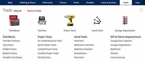
Sears has been using mega menus for a while. The Sears drop-down mega menu for the first-level category of “Tools” is shown below. According to the mega menu, this category is divided into four subsections: “Tool Boxes,” “Power Tools,” “Hand Tools,” and “DIY & Home Improvement.” These subcategories are repeated with images across the top of the mega menu, but there is an extra group called “Tool Sets” that doesn’t correspond to one of the four text subcategories. Using the text lists and not the images, users can select a second-level subcategory such as “DIY & Home Improvement,” but they can also select a third-level subcategory like “Garage Door Openers.” This is where the potential for causing user confusion starts to get out of hand.
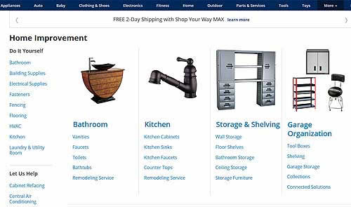
Selecting “DIY & Home Improvement” displays a landing page (shown below), but the name of this page is different from the link it came from: it is now just “Home Improvement,” and a new menu, “Do It Yourself” appears on the left. Even the subcategories have now changed to “Bathroom,” “Kitchen,” “Storage & Shelving,” and “Garage Organization.” Three of those subcategories were on the list on the previous menu; two subcategories that were on that list are no longer on this page; and one completely new category now appears.
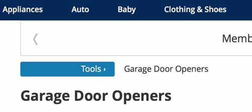
Worse yet, selecting the third-level “Garage Door Openers” from the first-level “Tools” menu (it’s not an option on this landing page) takes the user to the correct third level of the site, but the breadcrumbs (shown below) tell the user that “Garage Door Openers” is a second-level category under “Tools”.
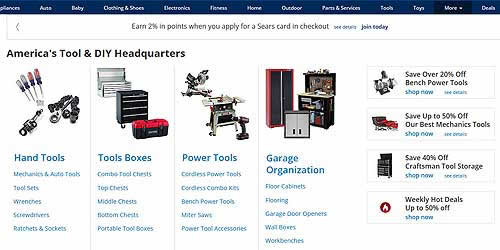
It gets even worse. Bypassing that first drop-down menu displaying the second-and third-level choices, the user can click on the first-level “Tools” menu from the Home page, close the drop-down menu, and find themselves on yet a third representation of the site on the page (shown below) called “America’s Tool & DIY Headquarters,” with the subcategories “Hand Tools,” “Tools Boxes,” “Power Tools,” and “Garage Organization”.
Finally, though the images might look like specific products to select, they aren’t. They are additional links to subcategories that have all appeared in different configurations on different menus.
As far as the user knows, Sears has five different site architectures! And this doesn’t include the additional mega menu functionality for the “shop all” and “Deals in Tools” links, which also appear on the “Tools” mega menu.
Now consider the Food Network site, another site that has been using mega menus for a while. The “Shows” drop-down menu (shown below) appears pretty straightforward at first glance, but what’s the difference between the collection of “Featured Shows” and the unlabeled four shows displayed on the left? Are those four links extra specially featured shows? Then there’s a set of blogs about shows and links to whatever shows are currently playing, which are related to shows but not necessarily separate categories in the site structure. Then look across the bottom of this mega menu and you’ll see even more. There are links to three full episodes that have previously aired, a listing of all the stored previously aired shows, the full TV schedule, and something entitled “More Shows,” which turns out to be a link to the same page you get if you select the Shows main menu.

If you select the Shows menu, you land on a page called “Shows & Schedule.” If you select a show from the drop-down mega menu, it seems to confirm in the breadcrumbs (shown below, for “Southern Fried Road Trip”) that this show is listed on the “Shows & Schedule” page. So, in this case, the grouping and titles appear to be just menu separators.

The problem is, though this works for some shows in the mega menu, not all shows are actually listed on the “Shows & Schedule” page. For many shows, you have to click one link deeper to find their page. In addition, the “Shows & Schedule” menu has different subsections than shown in the mega menu, including top photos and new series. Finally, the featured shows on this page are different from those listed on the mega menu.
We have encountered these kinds of issues on almost all sites with mega menus we have tested. We have also seen some cases where mega menus include interactive functions and search tools, making the mega menu more than a group of submenus.
The goal of a mega menu should be to help users understand the site structure. Grouping and titling menu items is its only job. Introducing new architectures, adding multiple options for navigating, providing alternate names for the same thing, and interactive features seem to come from a mistaken idea that users need to do everything as quickly and in as few steps as possible, and that more options are better. Efficiency cannot be obtained if it adds confusion. That will backfire. Mega menus need to be treated as simply menus – not alternative interfaces to a website. As Albert Einstein once said:” Everything should be made as simple as possible, but not simpler.” That includes mega menus.