


In the March newsletter, we discussed how the human brain filters the scene before us, sometimes aggressively, to pick and choose the information that gets through to the brain for processing. Though this discussion was about visual information, it also applies to auditory and even tactile information. The most important aspect of this fact as it relates to interaction design is that we cannot guarantee that all the information presented to a user is processed. This is particularly true when the information is complex and multi faceted (think home pages on many websites that contain rotating images, snippets of selected content, the latest news, multiple navigation options, contact info, and more).
Last month we discussed how we process information that we don’t even look at (the information that is in our peripheral field of vision) and how our brain uses what it perceives there to determine if we should move our attentional focus to this information. Again, while we were discussing visual input, this applies to auditory and tactile information as well. Probably the most well-known version of this for sounds is the “cocktail party effect.” This is where we monitor other auditory information going on around our primary conversation, but we don’t switch to it unless we perceive it (or think we perceive it) as important, such as when someone across the room uses our name. The most important aspect of this fact, as it relates to interaction design, is that the decision making process about information we are not actively focused on is often flawed due to the limited fidelity of the information present.
This leaves us with one more area to discuss—- the notion that we accurately perceive what we decide to look at and choose to process, even if that is a small portion of what is right in front of us. If you’ve been reading these newsletters, you’ll probably guess what’s coming next: It’s not that simple.
I own a smartphone with a camera. It is not the best camera in the smartphone market, but it’s pretty good. It has an 8 megapixel sensor. As of this writing, the highest camera resolution available on smartphones is 41 megapixels. Even at this resolution, no one looking at a picture from a smartphone (or even a good SLR) ever confuses a picture for real life. You might conclude from that fact that the human eye must be an extremely high resolution sensor. In fact, the human eye has an approximate equivalent megapixel resolution of one megapixel. Yes, that is not a typo. One megapixel. The richness of our visual field does not come from the eye itself. It comes from what we do with the information that we perceive as it is processed through the brain. The rich detail that we see is therefore completely in our minds. And what our minds decide to do with the low-resolution information is rather complex and based on a set of assumptions only partially understood.
Consider the two pairs of objects in Figure 1 below. The first image is a combination of a plus sign and a dot. Close your left eye and look directly at the plus sign. Then slowly move closer to the image (or print the page out and move it closer to your face). At a point a few inches away from your face, the dot on the right-hand side will disappear. Note that this will only work if you keep your main focus on the plus sign.
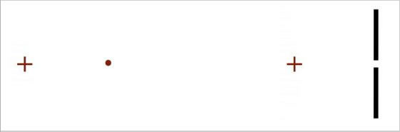
Figure 1: The Demonstration of Visual Data “Fill In”
This phenomenon occurs because this procedure places the dot within the optic nerve of the eye—- an area without any photoreceptors. This area is known as our blind spot. But our visual processing system does not allow us to “see” a hole in our vision. We “see” the visual information that our processing system assumes is there—- in this case a white field and not a lone dot floating in space. In other words, our visual processing system fills in with white space, and what we “see” is not really what is in front of us. (Ironically, there was one historical figure that loved to do this visual trick at parties, where he would look to the side of one person at the correct angle to cause their heads to be placed within his blind spot. The effect of this little game was to cause the person’s head to disappear. That historical figure was King Henry VIII of England.)
Now repeat the same experiment with the image on the right. In this case, at the same distance away as in the first experiment, the two lines will suddenly become joined. Our visual processing system will insert a line segment between the two line segments. “Seeing” at this level is unconscious processing of data that enters (or fails to enter) our eye. And our brain decides to add visual information to the information originally received by the eye. The same is true for all our peripheral vision. Due to the lack of cones in our periphery (cells in our eyes that process color information), information coming in from our peripheral vision is actually black-and-white. We do not perceive the fade out of color from our central vision to our peripheral vision because our brain adds in what it assumes to be the correct color for these black-and-white scenes, like colorizing an old black-and-white movie.
In addition, the relationship of other objects in the area in which we look has a profound effect on how we consciously perceive these objects. This phenomena was studied as far back as 1889 by Müller-Lyer. Consider Figure 2 below. The figure shows a pair of blocks either side-by-side or on top of each other. One block is light in color and the other block is dark in color—- or so it would appear. You may be surprised to learn that the two largest blocks on top of each other in the front of the image below are actually the same shade of grey. To prove this to yourself, place a finger across the edge where the two blocks meet.
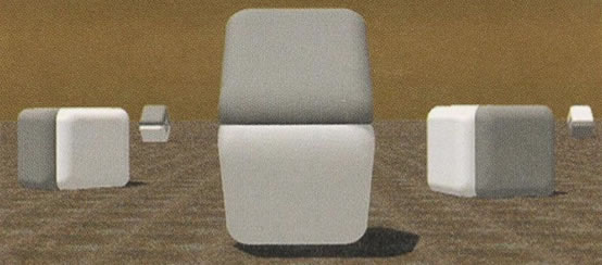
Figure 2: The Demonstration of Relative Perception
The gradient that ends the bottom of the top block and the reverse gradient that ends the top of the bottom block are incorporated into our perceptual system and cause our brain to determine what we believe is in front of us, even though it is not an accurate representation of what is actually there.
Another example of our inability to accurately perceive the information right in front of us is shown in Figure 3 below, originally developed by Roger Shepherd. This figure shows two apparently different coffee tables. In actuality, the two tabletops are exactly the same size, just rotated by ninety degrees. You’ll probably need a ruler to prove this to yourself since just knowing this information will not change your visual perception.
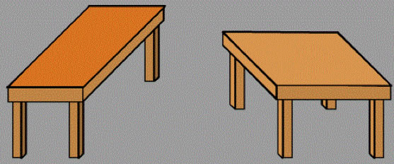
Figure 3: Roger Shepherd’s “Turning the Tables”
There are many other underlying mental rules that determine how we ultimately process the information within our visual field. Many of these fall into the category known as the Gestalt principles, but that’s a discussion for another day.
When we put these three main elements together, we get an interesting set of findings: (1) we don’t process all the information that we look at, (2) we process information that we don’t look at, and (3) the information that we do look at and process is not always accurately perceived. This trifecta of the human visual processing system has significant implications for interaction design. If we understand and take into account these three elements of our visual processing, we should be able to design effective screens. But we have to be careful about overcomplicated visual scenes.
We have to be careful that visual elements in our periphery do not induce us to perceive them as independent (e.g., advertisements) or only tangentially related (e.g., related links) to our primary focus (unless they are). And when we think we have a good visual design, we have to test it. And it needs to be tested correctly. Testing it by determining if the user has found the screen with the information on it (the only end goal tested in a lot of usability evaluations) is not sufficient. Detecting where the user’s gaze is at any moment (the purpose behind using an eye tracker in usability evaluations) is not sufficient either. In other words, we need the interaction design equivalent of “trust, but verify.” Then, in our usability evaluations, we have to go beyond just observing them and seeing if they find the information. We need to talk with them about their perceptions. It’s not a simple task, but it is a necessary task.